
Can drunk user testing save your website?
Time is a valuable resource nowadays: we want everything and we want it now yesterday! This, of course, is also true on the Internet. You could create the most exquisite design and write the most exciting copy imaginable for your website in vain: if your visitors do not find immediately the information they are looking for, they will surf away.
Seen from your vantage point, everything seems as clear as can be; but did you ever try to put yourself in the position of people who actually visit your website? Of all those people? Would your 92-year-old grandma intuitively find what she’s looking for? Really? And what about your uncle Bob? Would he know how to surf your website at 1am after drinking empty your wine cellar on Xmas eve? If he can do it then anyone can, can’t they? Well that’s what Richard Littauer thinks and that’s why this US developer launched a concept of inebriated surfing as a way of testing your website’s user-friendliness.
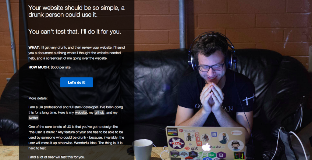
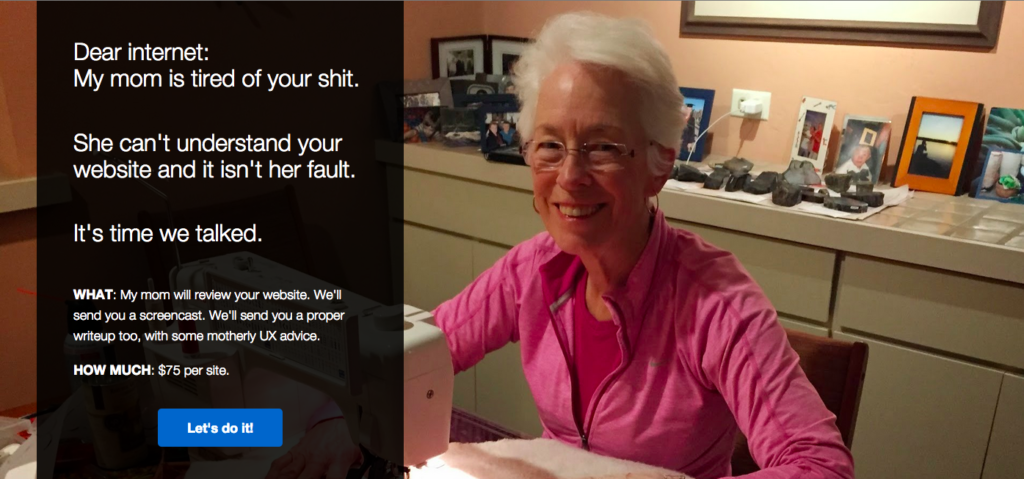
For $500, Richard Littauer gets drunk before testing your site’s functionalities. Clients get a commented screencast of the experience as well as a written report. Seriously. And – also seriously – his mother is in the business too. She is cheaper ($75) and, according to Richard, “yells at her computer, doesn’t know what a twitter is, and struggles to find windows she’s minimized.” Many serious, big-traffic websites could find a large portion of their target audience covered by Richard and his mum.
Why it’s actually a good idea?
Because user testing is an essential part of websites’ user-friendliness. But this doesn’t mean that you should have an almost finished prototype tested: it leaves very little room for modifications and, even worse, the corrections could generate even more bugs! The proper way to proceed would be to organize user testing throughout the whole conception and development process. This can be done from the very start with wireframes and via eye tracking. Ideally, this is done very meticulously with the help of several people experimenting navigation on your site during the building phases, on several versions in order to choose the best option at every development crossroad.
Why it might be a bad idea…
Because user-friendliness is highly dependent of the audience specifically targeted by your website. Which means drunks and moms might not be a big part of your audience. Websites with directions and arrows all along the user journey are as oppressive as sites with maze-like architectures. One should not overestimate users – “If I can, anyone can” – nor underestimate them – “they’re all morons anyway”. First things first: learn to know your users! How old are they? How Internet-y are they? What are they looking for? How are they looking for it? What’s troubling them? One thing is absolutely certain though: universal user-friendliness is a myth.
If you want to know more about user-friendliness, read our article about wireframes and how they can make or break websites.
Our recent blog posts
See all blogs-
How is AI’s synthetic data enhancing User Experience Research? Technology

-
Web3.AI Rising : How new technology can add value to your business

-
How generative AI helped us create an e-commerce app – with personalised content – in just 2 weeks Technology

-
Can you build a foodie app in 3 days using Generative AI? (Spoiler alert: yes!)