We've just reinvented The User Agency.
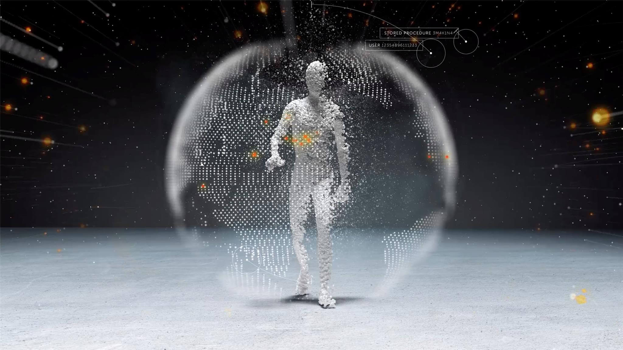
For almost 25 years, Emakina has been known as The User Agency - by always putting the value we can unlock for humans at the core of everything we do. And since becoming a part of EPAM in 2021, we’ve collaborated with some of the world’s best engineers to take the original intent of Emakina to a whole new level. Today we’re proud to introduce Empathy Lab, by EPAM. The world’s first agency built from the ground up by data scientists and engineers, in collaboration with creative minds from all disciplines. We use technology to help brands be more—not less—human. It’s a new name but wrapped around our core DNA. Empathy Lab is equipped with the infinite scale of data and AI, blended with the heart of human creativity and understanding, so that we can go beyond just placing users at the core of what we do. We can make a real connection through genuine understanding. Will you join us in this new era?