Candriam
Fresh future-forward brand identity
Candriam has built a reputation for its human, innovative and responsible approach to investing. To better reflect these values, the investment pioneer wanted to evolve by bringing a sense of strength and depth to its brand image. As a long-standing partner to Candriam, Emakina relished the challenge to refresh the brand’s visual identity.

The challenge
The financial industry faces daily challenges and has to constantly adapt to keep up with the demands of tomorrow. As a company with sustainable investing at its core, Candriam wanted their brand guidelines to accurately reflect the personality of a company that has grown alongside a competitive and ever-changing environment. It’s a company that walks the talk and holds itself to the same high standards as it expects from the companies it invests in. It was our task to get to the heart of the brand to showcase its unique personality and strengths.
Our solution
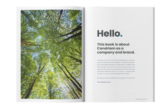
Candriam is a company made up of many talents and business units, with people from various languages, nationalities and experiences. We hosted workshops, inviting various employees to give their take on Candriam’s brand personality, communication and objectives. We also analysed market competitors, which gave us great insights into developing a new visual identity. These insights helped us create the first part of the Candriam brandbook, including a new manifesto, articulating the brand personality, crafting the vision and mission, brand essence and tagline, plus a tone of voice.

With a solid understanding of the Candriam brand, we had the foundation to build a coherent design to bring it to life. From the start, our intention was to make everything clearer, fresher, more minimalist and modern. We wanted to make the environmental, social and governance criteria that guide Candriam’s choices visible at a glance, as well as their approach. This meant redefining Candriam’s font family by choosing a stronger font with simple shapes for increased readability in every situation – from mobile screens to long articles. We redesigned the colour scheme, introducing a brand-new combination of blue and green that brings freshness, joy and a focus on sustainability to the brand.
On top of the design research, we created a new image library, covering common themes and subjects, and aligning the look with Candriam’s mindset and values. What better way to show the real face of Candriam than with its own people in their everyday environments? We shot staff members at work, showing the very human and accessible approach behind the brand. Put together, these assets convey a premium image without being too exclusive.


The results
The new brand refresh is the latest success story of a rewarding eight-year collaboration between Emakina and Candriam. The first communication element that was revamped was the Candriam website, for which we restructured the sitemap and redefined the UX and UI. We also delivered print materials such as brochures and corporate stationery, and produced a behind-the-scenes short film about the creative process. The client is delighted with the result – a refreshed visual identity that strongly asserts the forward-looking values of the investment company and its renewed commitment to ‘investing for tomorrow’.


